
If you are serious about your online business, you NEED to optimize your website for Mobile SEO.
Why?
Well, 68% of companies have already included mobile marketing into their overall marketing strategy. Whereas, 71% of marketers believe mobile marketing is important to their business.
And it’s becoming even more serious marketing tactics every day.
In today’s guide, you’re going to learn everything you need to know about Mobile SEO optimization.
What is Mobile SEO?
Mobile search engine optimization is following the best practices to make your website easily accessible to the smartphone and tablet users. Mobile SEO optimization activity also involves making your website search engine friendly.
Why Is Mobile SEO Optimization Important?
In general, the number of mobile searches is GROWING every day.
As a matter of fact, 57% searches on Google performs through mobile devices compared to desktop.
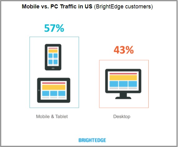
And…it’s growing even faster than our imagination.
In fact, According to Google, 27.8 billion more queries have been performed through mobile than desktop search.
Additionally, 64% shoppers this holiday season used smartphone to buy gift and other items.

No doubt, mobile is the future of SEO. Even Google’s latest algorithm are running around mobile.
Should We Care About Mobile SEO?
Of course, when you are optimizing your website for Google.
Here’s the interesting part…
A mobile optimized website does not only rank well in the search engine but, ALSO increases your conversion rate by 160%.
Even Google wants people to have a mobile-optimized website in the FIRST place.
To make it happen…
…Google rolled out its Mobile-Friendly Update (Mobilegeddon) and started penalizing sites which are not mobile SEO optimized.
I know what you’re thinking…
Is Mobile SEO is Different than Desktop SEO?
Pretty much, yeah.
Actually, there are lots of differences between mobile SEO and desktop SEO, but the goal often remains the same.
Conversion and reaching out to the potential audience and convert them into paying customers.
In some cases, desktop SEO works for mobile SEO, but in different ways.
The core elements that remain same for both (desktop and mobile) are:
- Focus on performance
- User-experience
- Website content
Desktop search engine optimization more focuses on general public, while mobile SEO optimization is all about the local audience.
You shouldn’t bother about mobile SEO ranking unless your target audience looks for your services and products on mobile OR Google makes it necessary for everyone.
How?
By changing their algorithm “Mobile-First”…
What Is Google’s Mobile-First Index?
Google’s Mobile-first Index ranks a web page based on the content that appears on the mobile, not the desktop as it used to be.
Earlier, Google used to rank two versions of a website: mobile version and desktop version.
If someone searches from mobile they see the mobile version starting with “M” whereas desktop searchers see the same website.
But now, you can search through any device Google will show you results from their mobile index.
Source: searchenginejournal.com
As you can see that there are no changes in the content of both versions of the site.
Should You Worry About Google’s Mobile-First Index?
Umm…
Not exactly, if you already have optimized your website for mobile SEO.
In fact, you shouldn’t worry about Google’s mobile-first index if your website:
- Opens on all devices
- Don’t hide content from your mobile audience
- Loads fast in mobile devices
- Has responsive design
- Provide ultimate user-experience
If not then you may see the ranking fluctuations in SERP.
Stay with me…
I am just going to tell you how to do mobile SEO with the help of these advanced mobile SEO techniques.
How to Optimize Your Website for Mobile SEO
Let me share a secret with you…
If you really want to get succeed with mobile SEO ranking you need to give what Google wants.
To put it differently, your website should be mobile-optimized and must be open on mobile devices.
You aren’t using the “M” version of your website. Are you?
Stop using that if you are still using a mini version of your website.
Google hates that.
Don’t be sad…
…building mobile optimized website is not as hard as you think.
You can make a mobile website using these simple mobile website design methods.
1. Make a mini version of your website
We just talked about it, didn’t we?
This is where you make a different website with the same content as desktop website. The only difference is – it only serves mobile users.
For example – Your original website is example.com, it’s mobile version would be
m.example.com
But there is one problem…
Building a mini mobile site is not good for SEO. Furthermore, you’ll need multiple URLs to do mobile search engine optimization.
If you take my advice, I wouldn’t recommend building this type of mobile website.
In other words, this is not the mobile SEO best practices.
But I have something for you…
2. Responsive Design
It must be a part of your mobile SEO strategy when you are working on mobile search optimization.
Responsive website adopts the device screen size in which it is opening.
The best part?
It serves the same content for everyone whether it is a desktop user or a mobile user.
Apart from that, there are other benefits of responsive websites:
- Don’t need multiple websites to serve the same content (Good for SEO)
- Better user experience with fast loading speed (all about RankBrain update)
- More mobile traffic No redirects that minimize the technical SEO errors Boost the audience engagement Increase the conversion rate
Don’t believe me?
How about if Google says itself that it loves responsive layout?
Use Google’s Mobile Usability Test
So, your mobile website has been designed.
Now, what?
To get the most out of mobile SEO it should perform well on search engine…
…to check that you can use Google Search Console.
It will tell you if your website has any sort of mobile usability issue.
In order to get that information log into your GSC account. Then click on “Enhancements”—>”Mobile Usability.”
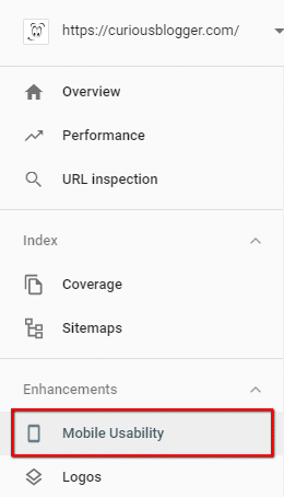
You’ll see if the mobile users are facing any problem while using your website.

There is another free Google mobile usability test tool name Google’s Mobile-Friendly test that you can use to check is your web page mobile-friendly or not?

…and you see something like this:
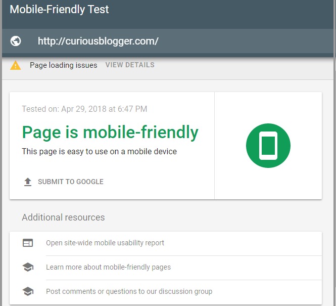
Whooo! my website is mobile friendly.
But wait…
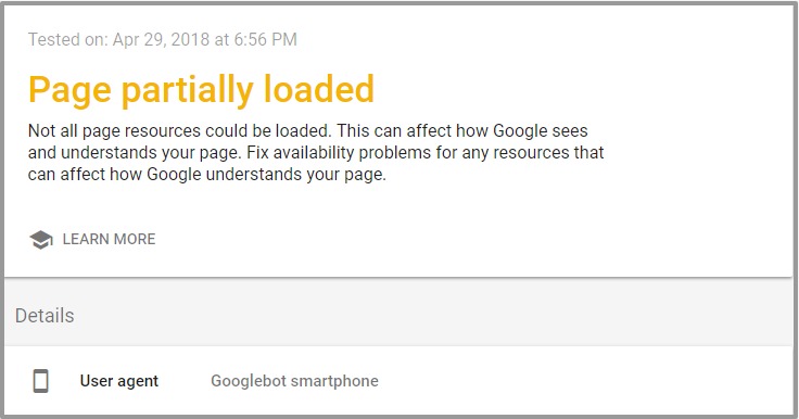
As can be seen, even though my site is mobile friendly but there are some issues that mobile bot might be facing when crawling my website.
However, my website works fine on the desktop, but when it comes to mobile there are things that need to be fixed.
Thanks to this free mobile usability tool I came to know about this problem. Now, I need to get this fixed in order to get Google’s blessing.
Here is something I have for you…
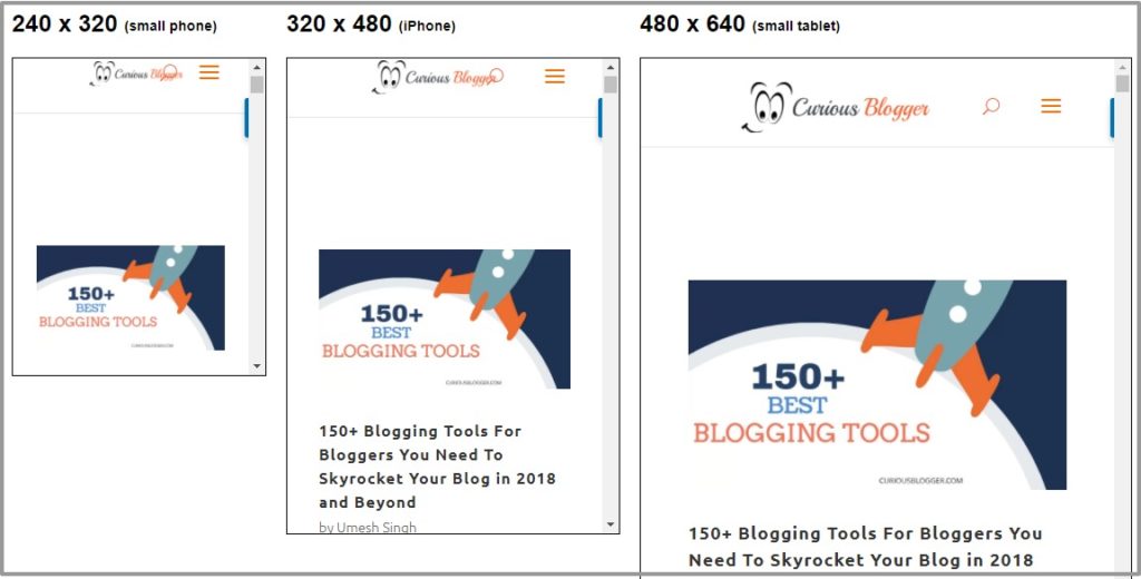
Ever wonder how does you responsive website looks on different mobile devices?
Well, here is an awesome tool that you can use to see how your website looks on different mobile devices (tablets, iPhone, etc.)
Use PageSpeed Insights to Optimize Your Website for Speed
Google loves speed. You know that, right?
As a matter of fact, they suggest you make your website loads in under a second for mobile users.
But…how do you know if your website loads at that time?
Fortunately, I have Google’s PageSpeed Insights tool that can help you find your website’s loading time.
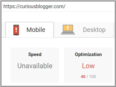
PageSpeed Insights is an awesome tool to analyze the performance of your mobile site.
Using this tool you can know how fast your website loads on mobile…
…as well as causes the low speed of your website. Therefore, you can fix those issues to boost up your website speed.
There is another tool Pingdom Website Speed Test that you use to check your website speed. It will give you enough insights to increase your website speed.

Make Your Content Easy to Read on Mobile Devices
Let me be honest with you this time:
Your audience hates your website, they don’t even want to visit your website again…
…when you make them scroll on LEFT to RIGHT on the mobile devices.
Actually, there are still lots of websites out there that are technically mobile optimized but the content on that is hard to read.
Here are some tips that you can use you make your mobile content more readable:
- Make sure your font pixels are at least 14
- Keep short paragraphs to increase readability
- Make sure your font and background are the contrast (it helps read content in light)
- Use strong headlines
- Use multiple sub-heads to grab the attention of users
- Make white spaces your friend
HTML5 is Your Friend for Video and Animated Content
You probably already know that Google doesn’t like flash content – and that’s the reason it’s not even going to help your website rank in SERP.
In case, if you using any videos or animations on your website that is coded in flash, please stop using that.
Because… that content isn’t going to work on mobile devices. Furthermore, it will drop your SEO ranking.
Fortunately, there’s a simple solution…
HTML5 – you can use it instead of flash. Moreover, HTML5 lets you create even more interactive visual content that Google loves.
How to Increase Mobile UX?
Having a mobile optimized website is not enough unless it provides eye-pleasing user-experience.
Here are some quick mobile UX hacks that you can use to boost up your site’s usability for mobile users.
1. Use Short Forms
On a desktop having a form with multiple options is okay – but it’s not going to work on mobile.
In other words, people will easily get frustrated to see a long form that covers almost complete mobile screen.
This is why I recommend keeping the form as short as possible.
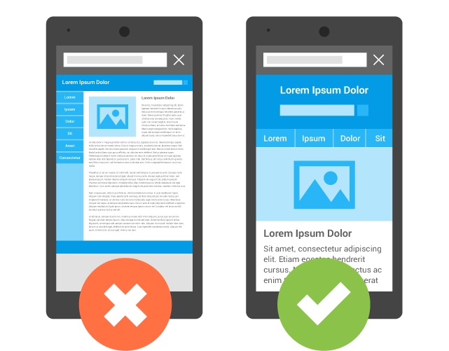
2. Make Feature Image Small
Mobile users have less patience than desktop users.
They want results fast and don’t like to scroll too much LIKE this:

In order to make them happy make your header image short.
3. Make Your Call To Action Visible
You know mobile users are like always in a hurry, they don’t like too much scrolling to something they want.
In fact, they want things to show up as soon as page loads. This is why it is important to place your CTA (Call To Action) button is an obvious screen location and make sure it accessible with one touch.

4. Make Navigation Simple to Find Services Easy
Webpages works in a different way on the mobile devices.
Especially when you have multi-level menus, it doesn’t help but force the audience to leave the websites because of frustration.
Simple and little option menu is best to increase the conversion on mobile devices.
Should You Implement AMP on Your Website?
AMP stands for Accelerated Mobile Pages, a Google open source project that aims to load your pages as fast as possible on mobile.
It has been while people are talking about AMP if they should implement it or not.
Furthermore, Google is showing extra love towards accelerated mobile pages, therefore, lots of SEOs started using it.
…and hoping that Google will reward their site with ranking.
But that’s not the case, Google never confirmed that it will rank a website higher which has AMP implemented.
There was a debate in SEO community to know – is Google AMP a ranking factor?
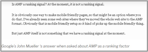
Though AMP is not a ranking factor, it can increase your CTR that is somehow a ranking factor.
And now, you are thinking…
Should you implement AMP or not?
See, you can use it if you want…
…but if you take my word, I’d say no:
The reason is:
AMP comes with lots of restrictions on your site such as it blocking popups, control on ads, and limiting the CSS to increase loading speed.
Moreover, it can devalue your link building efforts.
How?
You already know when you do link building, the links point directly to your website, agree?
But when it comes to AMP the links go to google.com first…
…and looks something like:
google.com/amp/yourwebsite.com
Therefore, when you do link building for your AMP implemented site it boosts Google’s domain authority instead of yours.
…And I’m sure you don’t want that.
In short, just because to increase mobile website speed you shouldn’t mess with other ranking factors.
Write for Small Screen
When creating content for the website always keep in mind your mobile audience.
Small fonts are hard to read on mobile because of the small screen.
Avoid too many long sentences, keep your paragraphs to around 2-3 sentences as well as use bullets points and multiple sub-headings.
User-experience is one of the big factors of mobile search engine optimization as well as conversion.
To find the issues check your content on smartphones.
Write Small Meta Descriptions and Titles
Google shows less information in the search for mobile results compared to desktop results.
In fact, it truncates your title and description if it is too long.
Keep that is mind when writing meta title and description for mobile users. Otherwise, you’ll lose several important pieces of information.
Desktop META Title: Around 70 Characters
Desktop META Description: Around 300 Characters
Mobile META Title: Around 65 Characters
Mobile META Description: Around 165 Characters
Here is a free tool you can use to check your titles and description looks on mobile. Therefore, you can adjust them for both mobile and desktop.
Optimize Your Website for Voice Search
Voice search is the next big thing the world are looking for.
It has become more interesting since Apple’s Siri, Amazon’s Alexa and Google’s Home assistant had come into action.
Don’t forget the voice search when optimizing your content for mobile.
People like voice search more than typing their query. In fact, 50% of all searches will be voice searches by 2020, whereas 41% are already using voice search.

Source: bluecorona.com
Therefore, you have to prepare your content for those users. It doesn’t only help you answer the query of mobile users but also can lead you the feature snippet or Google’s answer box.
To optimize your website for voice search seo, you need to look for the questions that your potential audience might be looking for.
Tools like Google’s autofill and Answer the public might help to find the ideas for your content.
Use Schema Structured Data to Improve Mobile SEO
Structured data is love – it can increase your CTR by showing extra information such as review stars, images and event dates in the SERPs.
It tells search engines that what does that extra information that you have on your website?
If implemented right snippet code, the search engine can give you highlighted search results.
In point of fact, structured data needs extra attention when optimizing your website for mobile SEO.
Final Words!
If you are serious about mobile traffic, you must have to optimize your website for mobile SEO.
This ultimate guide to mobile SEO almost covered everything you need to know to improve the performance of your mobile site.
I am curious to know if you are going to optimize your website for SEO.
Let me know your thoughts about this ultimate mobile SEO guide.


59 thoughts on “Mobile SEO: Only Guide You Need in 2024”
Very nice article. actually i was facing the ranking issue in 2018 now i have to change the seo things . so i will rank again .
Thanks again.
Shub I am big on keeping things simple on my blog, writing for small screens and keeping featured images tiny teeny LOL. Gotta do it these days if you want a respected site because most folks consume content on mobile. No way around it. I had a tough time hugging this idea until I woke up and checked stats. I am one of the few folks who reads stuff on laptop because I do so much writing, and have little time to futz around on the phone.
Ryan
Its a perfect articles on mobile SEO. Awesome information.
Hello
Shubhanshi,
Glad to read your post. This post covers all the necessary information about Mobile SEO. Indeed, the number of mobile users and mobile searches is growing tremendously and as a website owner everybody should have to care about Mobile SEO for their website. They must make an effort to create a mobile, responsive website to boost mobile SEO.
I like the ways you have explained the whole post. The step by step guide from your side is very information and easy to know.
Thanks for sharing.
Best wishes,
Praveen verma
Hi Preveen,
Thanks for stopping by mobile is the future and if we are not getting ready for it now, we’ll get behind and I’m sure no one here would like to get behind from his competitors.
Regards,
Shubhanshi
Keep up the hard work, you will rank again for sure. 🙂
All the best.
Hey Ryan,
Thanks for taking time to comment on my blog. I appreciate it 🙂
I also prefer laptop for reading whenever I am on my desk but as the stats and analytics graphs shows, mobile is something which we can never afford to avoid.
I read your blog posts on mobile as well, it looks awesome on the small screen as well.
Thanks once again for your comment.
Cheers,
Shubhanshi
Thanks for the appreciation Dr. Vijay.
Glad to see your comment.
Cheers,
Shubhanshi
Not optimizing for mobile these days is a big error Shubhanshi. You have pointed out required details in this post.
Have a wonderful weekend
Hi Shubhanshi, great article. I love the tool to check them on all different types of mobile devices, nice!
I do have amp but have not lost any traffic, it’s been good lately.
I do have to work more on the voice search.
Thanks for all the tips here as mobile is so key today.
Just a quick question. So if the meta titles for mobile is shorter than for desktop, does it then mean you should have different meta titles for mobile than for desktop?
Hey Shubhanshi
Great article. Mobile is the future. If you see the trend in startups there are many companies which only have mobile-only interface.
Back in days Myntra also went mobile-only.
It is the next big thing and ignoring it could be the biggest mistake.
If you have good optimized theme and if you are using AMP it can get a huge CTR .
Hi Shubhanshi,
Your post is amazing, and i really like the way you presented it. Ever since 2015, mobile internet users have surpassed destop users. In fact, Google has shown it’s preference to mobile over desktop with its latest update of “mobile first indexing strategy,” which calls for the need to optimize your site for, or create a mobile responsive website.
Thanks for sharing 👍👌!
Agree with you. such a beautiful information about mobile SEO especially for beginners. Thnx for the sharing.
It is very important to attracting more peoples by guest blogging. Now a days it has a huge popularity for mobile SEO. I like your post very much. Thank You.
Hi Shubhanshi,
Thanks, Great article abotu mobile search engine optimization.
Yes, this is the article i was searching for! the all detailed content in very uncommon area of mobile SEO. guys, you must go through it, very helpful article i ever read.
Hi,
After a long time I read such a wonderful post about mobile seo. I am quite impressed the way you have represented everything without confusing readers. Mobile SEO strategy should be in the list when trying to do SEO.
Mobile seo is the future if you are not optimizing your website for mobile then you are in trouble and leaving money on the table. Most people think optimizing for mobile search engine optimization is hard but that’s not true. In fact, this mobile SEO guide has covered almost everything that you need to know about mobile SEO optimization.
Thanks for sharing.
Many months later, this advice is pure gold. Well done 😉 Go mobile or you are in trouble, these days, meaning your blog better look good on mobile devices since few read via their laptops these days. I am a dinosaur doing that LOL.
Amazing article and I have understood each and everything. You have elaborated this article about mobile SEO in a very nice way. Thanks a lot for sharing this information here.
Nice article Shubhanshi. With google’s ‘mobile first’ index in place we should be giving more focus to mobile SEO. AMP is also no longer optional for better CTR.
Thanks for sharing this amazing article online. I really loved the way you have included all the essential points in the above content. I personally get more than half of my blog traffic via mobile devices. It’s very important to optimize your site for mobile devices in order to grow online. Will definitely be sharing this article with my online network. Looking forward to more such quality content in the future… 🙂
Hi
Such A very Nice information In this Blog (Article). It is rare to find such a detailed mobile seo guide on internet with easy words. Keep up the good work
Such a nice information. After reading your post… i am all set and clear about mobile search engine optimization. Please keep sharing such meaningful information.
Hi,
The article is really nice.. New Information I have learned today. thanks sharing this. Mobile seo strategy and as you say voice search is the future of blogging. I want to ask which Content of Table You are Using. Thnx for the sharing 🙂
Interesting post thanks. I always assumed my theme was responsive and that there was nothing I needed to do, however, I used the Google tool as you pointed out to check and it’s come up with some errors! Whoops.
I suggest everyone double check with the tool, there are some small things that might need to be tweaked, I think I’ve fixed mine now, hopefully it has a positive effect on my SEO.
Thanks you for sharing such a wonderful mobile search engine optimization guide. This post has some beautiful mobile seo strategy that anyone can use and apply to rank his/her website in SERP.
Thank You so much for your valuable information, I get so much information from your blog and enjoyed reading this mobile seo guide. Now I am going to read your next blog bcoz you have good content. Thank you
In today’s modern time mobile SEO is one of the important factors to rank well.
Great Post. Keep sharing more of such posts.
Yes, voice search is the future of SEO. I’m using Table of content plugin.
Thank You so much for your valuable information, I get so much information from your blog and enjoyed reading this mobile seo guide. Now I am going to read your next blog bcoz you have good content. Thank you
Hello Shubhanshi,
First time I came to your blog. And really very informative post you’ve written. In your article, you’ve mentioned: “71% of marketers believe mobile marketing is important to their business.” I believe this is me, who is on that list as well.
However, thanks for your great article.
Masud Parvage
Founder @ Micro Dollarz
Great Article it its really informative and innovative post about mobile seo optimization and will help me to build the right mobile seo strategy. Thanks.
Very helpful and informative about mobile search engine optimization. Thanks for sharing such a wonderful mobile seo guide.
Excellent content, it’s very helpful!! Thank you for sharing such a nice and easy to read & understandable article about mobile seo optimization. Your blog is thoroughly amazing and illuminating.Looking forward to your next insights!!!
In today’s market, Mobile friendliness is very essential and your post is exactly relevant to this topic. This post is really helpful for those who want to do mobile SEO or build a mobile seo strategy.
Thanks for sharing such a beautiful informative post. looking forward to learning more from this blog. This is a piece of really good knowledge for us.
Great Article it its really informative and innovative post about mobile seo optimization and will help me to build the right mobile seo strategy. Thanks.
Hi Shubhanshi,
Very well explained about mobile SEO.
Brilliant post about mobile seo optimization. It has everything one need to make a perfect mobile seo strategy.
Thanks Shubhanhsi for sharing such a wonderful mobile search engine optimization post with us.
Amazing post about mobile SEO optimization. Thanks Shubhnashi for writing such an in depth post about mobile optimization, you have covered almost everything one should know about mobile search engine optimization.
Thanks,
Liton
Hi, really good article and appreciating work. Thanks For Sharing this mobile seo guide. Keep up the Good Work and keep writing the wonderful article like this.
Thanks for this amazing information about mobile seo optimization its really very helpful for me.
Thanks for the comprehensive mobile seo guide. I have followed your steps and my mobile version of site is good with no errors.
Hi Your post is awesome it’s really helpful content it’s excellent explanation every easy to understand thank you very much for sharing this valuable post.
Hey Shubhanshi you wrote an amazing article on optimising websites for mobile. Google page speed test is an amazing tool for mobile SEO.
Usually I never comment on blogs but your article is so convincing that I never stop myself to say something about it. You’re doing a great job Man,Keep it up. Your mobile seo guide is value-packed and has everything a guide should have.
Mobile SEO is important. In fact over 56% of people are accessing web using mobile. If one is not optimizing their website for mobile search engine optimization then are leaving lots of money on the table. This guide has everything that one need to build a perfect mobile SEO strategy.
Thank you so much for sharing and looking forward to learning more from this blog. It was nice to read this detailed mobile SEO guide.
Happy to peruse your post. This post covers all the vital data about Portable Web optimization. Without a doubt, the quantity of portable clients and versatile hunts is developing enormously and as a site proprietor everyone ought to need to think about Versatile Web optimization for their site. They should attempt to make a portable, responsive site to support versatile Website optimization.
I like the manners in which you have clarified the entire post. The bit by bit manage from your side is very data and simple to know.
A debt of gratitude is in order for sharing.
All the best,
Steven Hobbs
The great thing about this post is quality information. I always like to read amazingly useful and quality content. Your article is amazing, thank you for sharing this detailed mobile seo guide.
This is literally a very good detail guide, i’m having a very hard time fixing schema for amp versions. I wanna use JSON code directly into website, any heads up for that?
Excellent and decent post about mobile search engine optimization. I found this much informative. I’m impressed by the details that you have on this web site. Thank you for this post.
Hello Shubhanshi,
We know very well mobile SEO is the future and it really is as simple as that. Google has put the online community on notice that those sites that don’t cater to both mobile and desktop users will lose their position in Google’s organic rankings.
Your responsive website will not only ensure that every customer, regardless of the type of device they are using can access and navigate your website easily but it also allows your website to load faster on mobile devices, which is a factor that can affect your websites overall conversion rate.
Eventually, thanks for exploring these facts for us.
With best wishes,
Amar Kumar
Really Great work Man, Thanks for your share information, this saved me a lot of time. All of the posts on your blog are having informative and valuable content. Appreciate your efforts.
This post has some beautiful mobile seo strategy that anyone can use and apply to rank his/her website in SERP. It has everything one need to make a perfect mobile seo strategy.
This blog has some serious Mobile SEO tips that can really help boost the traffic. The level of research done before creating the content is really top level hard to get such content in one blog. Must read.
Comments are closed.